Create Attractive Navigation Menus Using Elementor
Offer better user experience with beautiful Elementor menus that make website navigation both – easy and fun!


Watch Walk-through Video
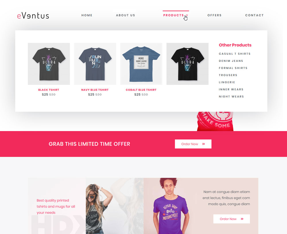
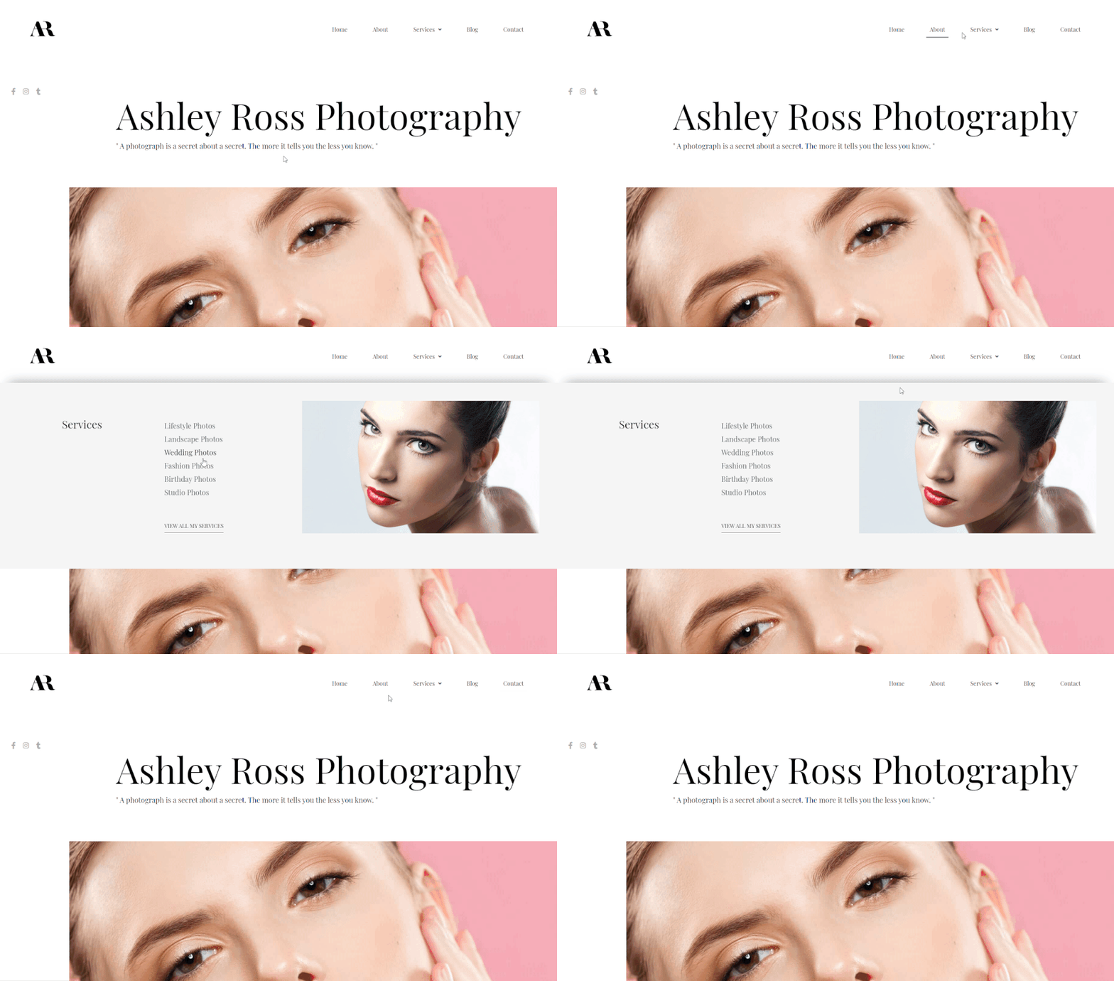
Mega Menus for Better Website Navigation!
Menus play an important role in user experience since this is the first thing a user looks for while exploring your website. Well-designed and simplified menus make navigation easy and fun.
Build attractive Elementor menus in which you can add different content types, style them beautifully and enhance with great visual effects.
Beautiful sections designed with Elementor can now be easily added to your functional navigation menu. Enhance the WordPress default menu or create a completely custom menu with few clicks.
You can create an infinite number of pixel perfect menu designs that match the look and feel of your website.
Beautify Your Website Menus with Elementor!
The Navigation Menu widget lets you create designer Elementor menus quickly and easily. It comes with several styling options that let you enhance your website navigation within minutes.
Add Different Content Types To
Create a User Friendly Functional Menu
The Navigation Menu widget of the Ultimate Addons lets you add different content types that match the need and purpose of the menu.
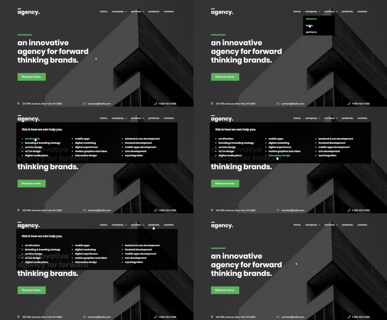
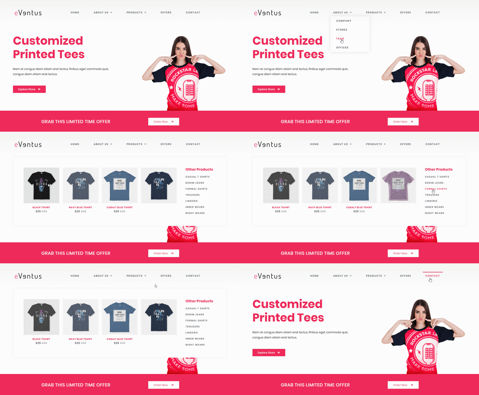
It supports WordPress menus, custom sections built with Elementor along with simple text, images, maps, forms, shortcodes and much more. You can also fetch saved sections and widgets within a mega menu created using this widget.

Add Eye Catching Visual Effects For
Displaying Interactive Menus
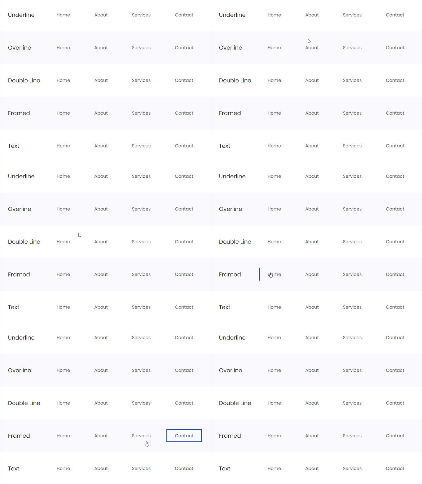
The Navigation Menu widget allows you to add link hover effects and animation that lets you create different effects for your hover and active menu items.
You can add underline, overline, text, framed and double line effects to each of your menu items.
Spacing Control And Styling Options To
Enhance the Menus and Sub Menus
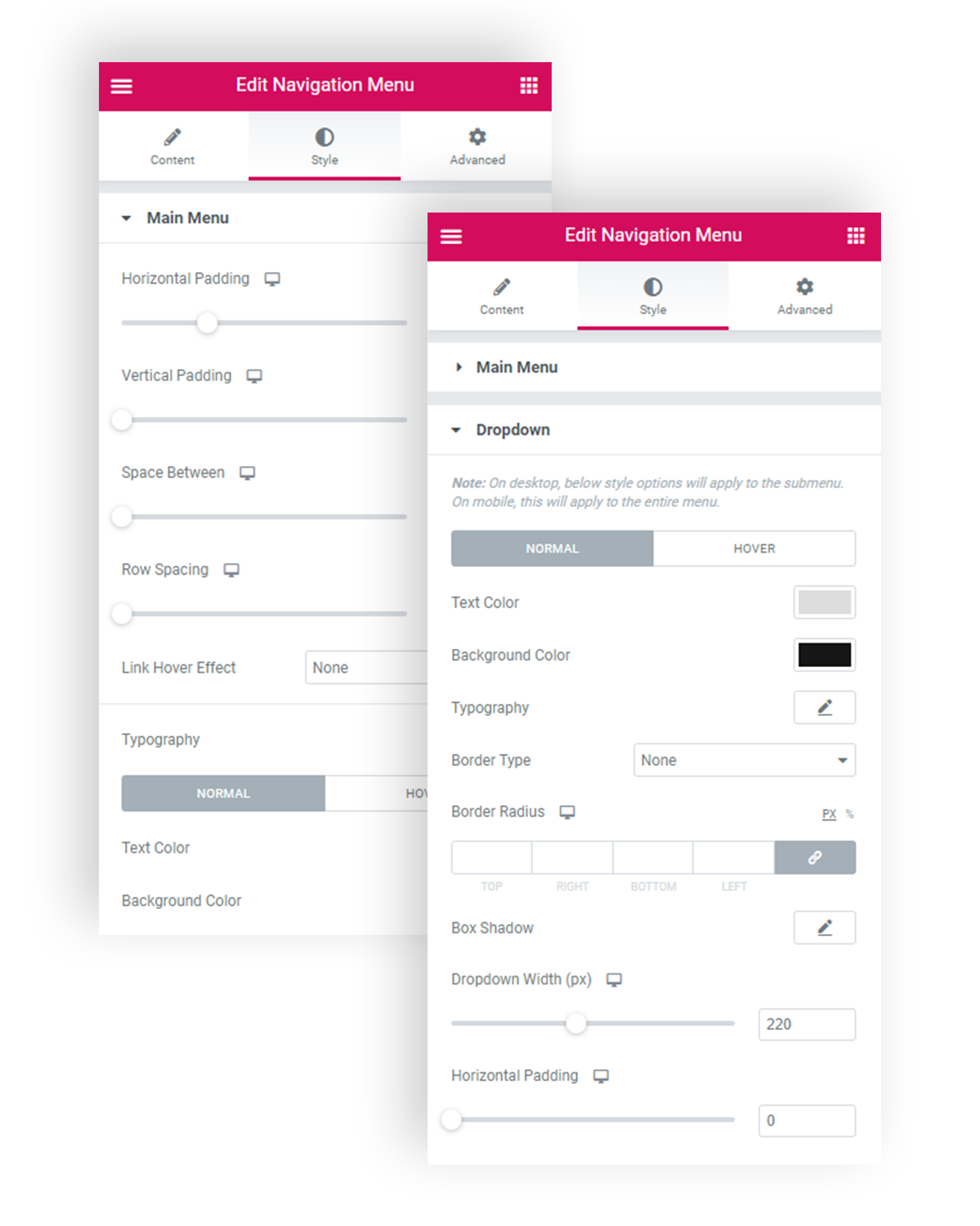
With the Navigation Menu widget you get complete flexibility to blend the menu in your style. You can manage spacing between all elements, their width, position, colors, background, separators, borders and menu trigger & close icon.
The widget also lets you manage the typography of each menu item and submenu that you add within it.

Responsive Menu Options To
Build Device Friendly Menus
The Navigation Menu widget lets you build responsive Elementor menus that look good on all devices. It comes with a separate set of settings that let you manage how your menu will look when accessed from different screen sizes.
The responsive menu options let you –
- Set breakpoints for your menu
- Opt to display a full-width menu when opened
- Decide whether menu should be closed or compressed into a vertical menu.
- Align mobile menu to center or left
- Style toggle button and manage alignment
- And more…
Enhance Menus with Special Layouts
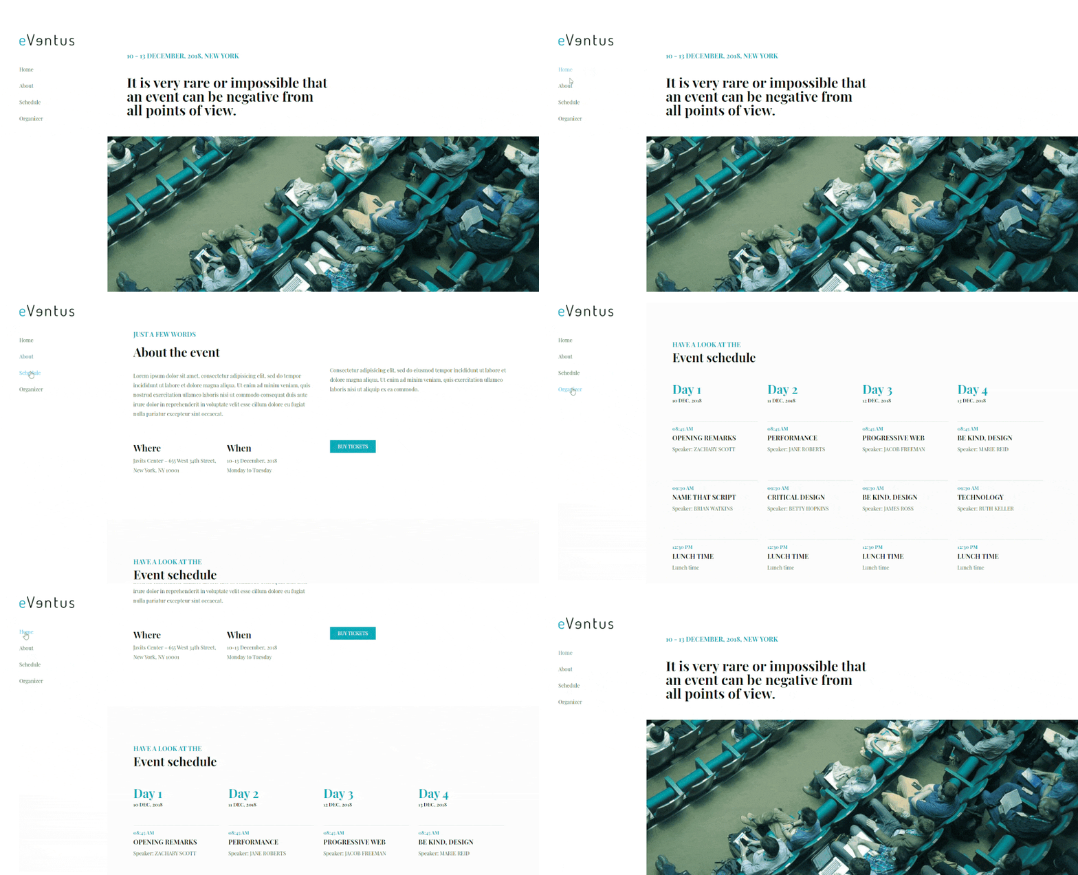
The Navigation Menu widget lets you pick a menu layout of your choice. The available layouts include horizontal, vertical, expandable and flyout.
Horizontal
Vertical
Expanded
Fly-out

